you ever had doubt whether you picked the right font for your poster, invitation, essay, or printouts? It doesn’t matter if you’re the CEO of an oil company, a dentist, a small business owner or a teacher, it is smart to choose the kind of letters that will communicate your message the way you imagine it. Yes, words have meanings, but even the most meaningful message would get lost if the letters were too tiny, too old fashioned, or just not formatted the right way.
Let’s look at a few examples. Which one of these fonts would work best for the menu of your new pizzeria?
Calibri – Margarita Pizza, Barbeque Chicken, Pepperoni Pizza, Hawaiian Pizza
Book Antiqua – Margarita Pizza, Barbeque Chicken, Pepperoni Pizza, Hawaiian Pizza
Bradley Handwriting – Margarita Pizza, Barbeque Chicken, Pepperoni Pizza, Hawaiian Pizza,
Brush Script – Margarita Pizza, Barbeque Chicken, Pepperoni Pizza, Hawaiian Pizza
Quick, pick before you keep reading! I prefer Calibri or Bradley Handwriting. The first one is a bolder, chubbier font, so it makes me think how full I’ll be after eating the pizza, and the second font has the homey characters, which makes me think of the Italian grandma standing by the stove cooking that authentic Italian tomato sauce.
Fonts, like the Bradley Handwriting, that imitate written characters, are also useful to add that human touch to emails. For example, I frequently use the Bradley fonts to “sign” my name at the bottom of emails. If you add a different color, too, it creates that personal touch, like this:
Monika

One theory is (teachers, pay attention here) that the fonts that are easiest to read will lead to less retention, than the more challenging ones. Read the following paragraph about Napoleon written in two different fonts. The first one is written in Helvetica, the second in the more unusual Castellar.
Napoleon was the second of eight surviving children born to Carlo Buonaparte (1746-1785), a lawyer, and Letizia Romalino Buonaparte (1750-1836). Although his parents were members of the minor Corsican nobility, the family was not wealthy. The year before Napoleon’s birth, France acquired Corsica from the city-state of Genoa, Italy. Napoleon later adopted a French spelling of his last name.
Napoleon was the second of eight surviving children born to Carlo Buonaparte (1746-1785), a lawyer, and Letizia Romalino Buonaparte (1750-1836). Although his parents were members of the minor Corsican nobility, the family was not wealthy. The year before Napoleon’s birth, France acquired Corsica from the city-state of Genoa, Italy. Napoleon later adopted a French spelling of his last name.
Which description of Napoleon did you pay more attention to? Do you think that choosing an unusual font type will spark more attention from your students? I bet it will!

Next, I’ll show you my favorite font picks, and give you ideas about which situations they could be most useful at.
Brush Script is perfect for a poem or a quote.
Comic Sans is great for kids activities (preschools, birthday parties, kids services).
Curlz is for anything fairy tales or little girls
Chiller is for scary things, think Halloween; it’s a really fun font, test it in your document creator, because it wouldn’t copy into my blog editor (C’mon WordPress!!!).
Century Gothic – a clean and round font type, easy to read, I would recommend it to a wide variety of businesses from doctor’s offices to spas and most everything in between.
Edwardian Script is the font for Shakespeaare’s Sonnets. Here’s the 18th Sonnet:
Shall I compare thee to a summer’s day?
Thou art more lovely and more temperate:
Rough winds do shake the darling buds of May,
And summer’s lease hath all too short a date:
Sometime too hot the eye of heaven shines,
And often is his gold complexion dimmed,
And every fair from fair sometime declines,
By chance, or nature’s changing course untrimmed:
But thy eternal summer shall not fade,
Nor lose possession of that fair thou ow’st,
Nor shall death brag thou wander’st in his shade,
When eternal lines to time thou grow’st,
So long a s men can breathe, or eyes can see,
So long lives this, and this gives life thee.
Harrington would be perfect for a garden party invitation or any fancy gathering or cause
Times New Roman is the old default word document font, do not use it unless necessary.
Times New Roman is the old default word document font on Windows computers, and because of it, I wouldn’t use it at all, unless that’s the only kind of font available to you. In that case, it’s time for a software upgrade or a brand new computer.
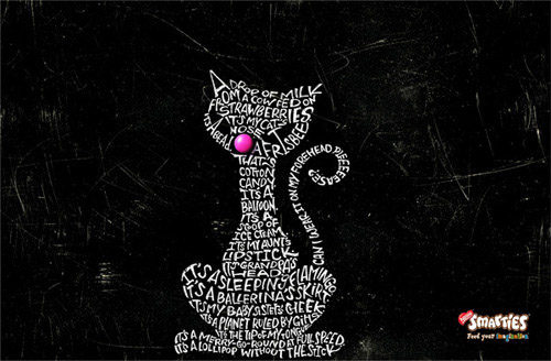
I encourage you to be more courageous using different fonts, and I hope that I inspired you for trying new things on your typography journey. If you crave to learn more about fonts, I loved this article about artsy design created by letters. I’d love to hear from you if you have success or you’re proud of something you tried with fonts in the comments below. Love always,
Monika
Resources:
http://www.hongkiat.com/blog/beautiful-creative-use-of-typography-in-print-ads/
free font resources are http://www.fontsquirrel.com and http://www.fonts.com
http://www.edutopia.org/blog/fonts-help-students-remember-read-jason-cranford-teague


